2019年8月16日星期五

Assignment 3 documentation


some tool and material 

Project: With the birds
Technique: Hand Cut
Scale:1:100
Material: Some bamboo strips, 1mm Plywood, iron wire, rubber band
total cost: 20 dollars

1. balance test

1: The two bamboo sticks can not achieve the purpose of balance support.

2: Three bamboo sticks can play certain balance support, but must be on the three endpoints of the equilateral triangle.

3: The bamboo dots stand on the four endpoints of the square, and the balance performance is the best.
2. assembly
During this time, it is difficult to measure and dug out the appropriate holes and but the balancing structure. Because the top intersection of the structure is smaller, and the extension of the bamboo strips is longer, the extension range is larger.


reflection:

This model reflects the support of the force and it can be assembled anywhere.
In the process of making the model, the difficulty of this design is to find the balance of the four bamboos and support them to bear the weight.

In the beginning, it was the most difficult thing to find a four-bamboo balance support point. I tried it many times. When the structure of the first layer is set up, and I began to built the second layer. there is another issue which is to find the force point of the second layer than the first layer because the support points of the second layer are at the vertices of one layer. Finally, I made some minor changes to the model with my understanding of the structure.


Project: The Flexible Bauhaus 


Scale: 1:200

Technique: Laser Cutting, Hand Cut

Material: 1mm Boxboard, Watercolor paper (axis), 1mm Plywood
Total cost: 50.3 dollars
1. sketch model

                                                             2. assembly
1: Cutting out the orbital arc.
 The light and shadows in the room vary with time due to the variety of facades.

 the interesting roof
Good lighted roof for easy natural light into the room


reflection:

This model reflects the relationship between the building and the surrounding environment. This relationship is represented by a rotatable shaft.
At first, I used a laser to cut the board and cut a lot of holes in the board, hoping to roll the board up. But when I got it, I found that because the length of the circumference was too short, even if the hole was cut, the wood board could not be rolled into a shaft shape. Therefore, I used watercolor paper and engraved vertical stripes on the paper to make the axis. Another point of the design is the track of a movable part of the building.

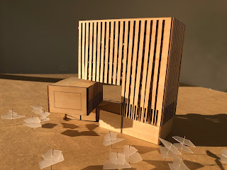
Project: Okurayama apartment

Scale: 1 100
Technique: Laser Cutting, Hand Cut
Material:1mm Boxboard
total cost: 100 dollars
For the first time, I chose a 2 mm thick boxboard, but the model curve was not ideal. the second time I used a 1mm thick boxboard.
1. sketch model

2. assembly
Cutting the vertical section to make the boxboard more flexible and form a curved surface.
After cutting, this boxboard shows a rough graininess like cement.


Due to the curved walls, the lighting in the room is very soft, and the shadows of the light vary indoors.


reflection:

The key point of this model making is the curve. The designer created this home through a complex and diverse space and winding lines.

The interesting thing about this design is the plane and elevation of the curve. The curve effectively increases the connection between the surrounding environment and the building. The internal connections of the building are reflected in the open, semi-open grey space. To make a curve with a 1mm boxboard, I engraved the vertical texture to form the ideal surface.

This model gives me a deeper understanding of the spatial relationship between the interior and the exterior of the building.


2019年8月11日星期日

Assignment 2 - The Fabrications

Project: With the birds

Comprehension: 
This model reflects the support of the force and it can be assembled anywhere. In the process of making the model, the difficulty of this design is to find the balance of the four bamboos and support them to bear the weight. In the beginning, it was the most difficult thing to find a four-bamboo balance support point. I tried it many times. When the structure of the first layer is set up, and I began to built the second layer. there is another issue which is to find the force point of the second layer than the first layer because the support points of the second layer are at the vertices of one layer. Finally, I made some minor changes to the model with my understanding of the structure.
Technique: Hand Cut
Scale:1:100
Material: bamboo, 1mm Plywood, iron wire


Project: The Flexible Bauhaus  

Comprehension: 
This model reflects the relationship between the building and the surrounding environment. This relationship is represented by a rotatable shaft. At first, I used a laser to cut the board and cut a lot of holes in the board, hoping to roll the board up. But when I got it, I found that because the length of the circumference was too short, even if the hole was cut, the wood board could not be rolled into a shaft shape. Therefore, I used watercolor paper and engraved vertical stripes on the paper to make the axis. Another point of the design is the track of a movable part of the building.
Scale: 1:200
Technique: Laser Cutting, Hand Cut
Material: 1mm Boxboard, Watercolor paper (axis), 1mm Plywood
wall and shading


movable part

movable part

roof

roof

shading


 Project: Okurayama apartment 

Comprehension: 
The key point of this model making is the curve. The designer created this home through a complex and diverse space and winding lines. The interesting thing about this design is the plane and elevation of the curve. The curve effectively increases the connection between the surrounding environment and the building. The internal connections of the building are reflected in the open, semi-open grey space. To make a curve with a 1mm boxboard, I engraved the vertical texture to form the ideal surface. This model gives me a deeper understanding of the spatial relationship between the interior and the exterior of the building.
Scale: 1 100
Technique: Laser Cutting, Hand Cut
Material:1mm Boxboard

entrance

Internal communication

external communication

interior space


2019年6月30日星期日

BENV7813 Contemporary Fabrication Techniques

Architectural Precedent 1

Project: Okurayama apartment     Designer: KAZUYO SEJIMA     Location: Tokyo, Japan

Key concept


"There are many open spaces in the middle of the base. The new life will gradually be revealed in the cut-out residential open space, which is connected to each other and green is integrated with outdoor activities and indoor activities. It is not only the integration of the external space of the building and the building, forming an environmental unit, and maintaining close contact with the surrounding environment." (KAZUYO SEJIMA)

The Okurayama apartment is based on the relationship between people and nature and the relationship between people and people. The creation of open outdoor space can solve the essential problem about the use of space in the external form. With a suitable environment to design an environment that is far away from the hustle and bustle, each households can exchange and enjoy the outdoor living. At the same time create a new connection with neighborhood and the relationship between people and the outdoor environment.
In crowded cities, the Okurayama apartment allow people living in the building to aggregate, and the communication between people increases, and the relationship between people and the outdoors is closer. This not only brought fresh air to the people of the city, but also brought a satisfactory courtyard to the nine residents in the apartment The households are intertwined and people's lives permeate the building.

Selected Design Elements

Entire building


The Okurayama assembly house is a collection of 9 residential houses with an area of ​​50 square meters. The height of the building is three stories, one part is double high and the height is scattered. Each household has a small courtyard. The first restaurant and courtyard are on the first floor, the bedroom and bathroom are on the second floor, and the first bedroom on the second floor will become the roof garden of other residents. This is intertwined, openness and liquidity are produced in such an interesting form, and a new connection is born.


The first floor mainly adopts the construction method of the base column, so that the building body is raised upwards, and at the same time, a small space is placed to avoid the effect of affecting the connection of the tenants.The outdoor balcony on the third floor not only enhances the integration of indoor and outdoor space, but also enhances the visual appeal of the appearance.

Nine households have their own entrances on the first floor. In order to protect the privacy of the owners, the bedroom is not designed on the first floor. The opening windows of each restaurant and living room are large, bringing outdoor views into the room. The green plants in the courtyard enhance the connection between people and the outside world, thus enhancing the communication between people. Therefore, the outer wall of concrete is not a cold interpersonal relationship.

How is the key concept reflected in the design studio

This project is a typical collection of residential designs. It starts from the psychological needs and physiological needs of people and pays attention to the spatial feelings of people. As the most-used and most frequently used building in the city, we need to study not only how to make the building more convenient and comfortable to use. At the same time, how to adapt and improve the urban environment. The plants in the house are pure white and the space is more delicate and vital. The introduction of green plants is to make the courtyard and the roof garden to achieve the integration of man and nature.

Geometrical description of the shape

site area: 457.77 sqm
built area: 210.58 sqm (gross)
total area: 561.80 sqm
maximum height of the building from ground level: 8.1 m
long: 25m
wide: 14.5m

 Proposed scale, material, technique

Scale:1:100
Material: concrete/plastic
Technique: 3D print

Time, Budget

Time: week 6-week 10
Budget: 50

Reference

Architectural Precedent 2

Project: The Flexible Bauhaus   DesignerPenda

Key concept

Bauhaus is an era of innovation and technological achievement, a new clarity of architecture, design and art. Bauhaus is not a form. It is about the expression of form. It defines not about shape; it defines about shape logic. It is not about aesthetics, but how to adapt aesthetics to daily use. Because Bauhaus was a combination of crafts and arts, the Penda design it as “extension of the city on one hand and as a connector to the surrounding park on the other.” (Naylor, G., 1968)


Their goal is to build a museum that serves not only as the extension of city, but also as a link to surrounding parks. The museum connects its overall building enclosure structure to the urban block around Dessau and is related to the material nature of the vegetation around the park, respecting the natural conditions to the city. Its height adapts to the adjacent building blocks and integrates with the texture of the city. With the rotary appearance, it contributes to the activities the park activities. Therefore, the museum has the ability to become a new source of inspiration for Dessau.

According to different seasons and different occupation loads, the design itself can respond skillfully. In a warm month of the year, museums must be a combination of park vitality. Dessau tourists and citizens can enjoy the activities, such as lying in the sun, running, playing with their children or attending concerts. Therefore, the new Bauhaus Museum needs to provide the possibility of park daily life. In winter, the park is usually an empty island in the center of the city, isolated from the surrounding environment. In these months, the museum has served as a visible landmark, increasing the flow of visitors to their exhibitions and events.

Selected Design Elements

The museum is in the park with a slender horizontal structure that integrates all the required areas into a compact building enclosure and occupies a place in the park. Museums are made up of two different emotional areas: This is an entity whose function is to invite visitors, open and transparent to the outside and exhibition space, and isolate from natural sunlight to protect works of art. 

All public areas are located on the lower floor of the museum, including lobby, activity places, museum shops and cafes. The two cuboids are 9 × 36 meters long and 7 meters high. Each entity is located on a circular platform, the axis rotates with its stable core cylinder as the axis, the core cylinder as the staircase, elevators and building hardware, such as cables and (flexible) pipes. Two flexible entities can rotate around the core cylinder and interact with the public life in the park to adapt to the changes of their environmental needs. The two rotating platforms can be opened, the museum will be connected to the sculpture park during the day, and it will be closed at night. So, museums are defined not by their form, but by their performance. (Penda, 2015) 

These two parts may be used to attract people and the workshop can be rotated to open meetings to the public; movies and video clips can be projected on the wall by rotating 90 degrees. The wall can even rotate at 45 and 135 degrees, allowing for a variety of activities. (Arch20, 2019)

How is the key concept reflected in the design studio

“how life evolved throughout history, what influenced its process up to the present and “Flexible Bauhaus” for its ability to “perform within the park and therefore transform its surrounding what architecture can add to increase the quality of life for the future.” (Arch20, 2019)

"A city is a rapidly changing and vivid place. In contrast to architecture, architecture is verbose, stable and passive. Then we start thinking about buildings, really interacting with people, and being able to respond and adapt to whatundefineds going on around us?

In my next studio, I will consider about the flexibility of building and its relationship between environment and users. This program gives me a inspiration of architectural variability and I would like to try this new form in my next design.

Geometrical description of the shape


9mX36mX7m  2 cuboids 
Total Wide:11.6m
Total Long: 97m
Total Hight:25.67m


 Proposed scale, material, technique

Scale:1:100

Material: screenboard

Technique: laser cutting

Time, Budget


Time: week 6-week 10

Budget: 100

Reference


Architectural Precedent 3

Project: With the birds
DesignerPenda

Key concept

“One With The Birds” is a flexible and sustainable structure that blends the sleeping cabin with the forest canopy. Inspired by Native American Tipis, it is removable and reusable. The structure is locked by a bamboo stick with a rope. The leaves have no effect on the field and do not cause any damage to the bamboo. “After the deconstruction of the temporary hotel, these materials can be reused as scaffolding on the construction site or reused as another temporary hotel. There are three benefits of this design: Ecological Understanding, Flexible Structure, Comfortable Uniqueness. (Penda, 2015) 

Ecological Understanding


In the design of the tent hotel, we use local bamboo materials as the main architectural elements, and the fast-growing nature of bamboo makes it a low-cost, environmentally-friendly and high-performance building material. The focus of the design is how the building is connected to the base without damaging the base, while not breaking the material itself. After ensuring that the tent hotel is demolished in one place, it will not leave any traces on the base, and it can also be rebuilt in other locations using all materials. (Penda, 2015) 

Flexible Structure


The tent's architectural design is inspired by the Native American Indian tents. The tents they build will never cause any damage to the surrounding environment and the materials themselves, because they use ropes to tie the knots so that the tents can be easily built. Demolition and movement is a fairly flexible building system. (Penda, 2015) 
For the structure of the tent hotel, we first use two inclined bamboos to frame the beams, so that the structure can be extended vertically. When the layer height and span are increased, the structure can be doubled to increase the strength. Then the bamboo is tied up with a rope, without a screw, the bamboo structure maintains its original state and can be recycled many times. The same connection can be extended over multiple latitudes, and the same nodes ensure uniformity and stability of the entire structural system. The horizontal slab system connects all the beams and creates space for people to use. (Penda, 2015) 

Comfortable Uniqueness


Create a space that is both comfortable and uniquely experienced. When we are hiking in the forest, we are surrounded by dense branches that block our sight and make us visually unappealing. . Assuming we are a bird, then we have a completely different experience. When we were children, we used some of the most direct ways to get in touch with nature, such as climbing trees to enjoy the high-altitude visual experience and exploring the original life experience. So in our bird house, people can find the simplest dream of childhood. Make a trip a reminiscing experience of childhood, watching the sunset on the terrace like a bird...(Penda, 2015) 

Selected Design Elements


The width between the shafts is 4.7 meters and the height is 4 meters. The bottom layer of the structure is raised so that the structure can be built on any terrain. Based on the triangular structure constructed by the crossover of bamboo, we created a triangular living unit that can be assembled onto the main structure. The living units are divided into different specifications: independent living units, family living units, public function units such as hotel lobby and restaurant, and separate shower and toilet.

How is the key concept reflected in the design studio

It is an interesting idea in building design and I want to apply this idea in my next studio design. According to different needs, the bird house can be a diverse building. Due to the flexible combination of structure and unit, the building can grow and shrink according to the needs of the function. From the small unit structure of the family to the unit body of the club scale or even a larger unit structure. The building is like a living body, and it grows harmoniously in nature. This kind of feeling makes us forget the hustle and bustle of the city, and the mind and body are placed side by side in the embrace of nature. This is also our architectural ideal - the organic symbiosis of people, architecture and nature as a whole.

Geometrical description of the shape

400cmX300cm Tent 
400cmX500cm Bathroom/ Toilet
500cmX2000cm Lobby 
Each high: 4m


Proposed scale, material, technique

Scale:1:50

Material: wood

Technique: handwork

Time, Budget


Time: week 6-week 10

Budget: 50

Reference